UI/UX
KASANE | Smart Mood-Based Shopping App

16 Oct 2024
Overview
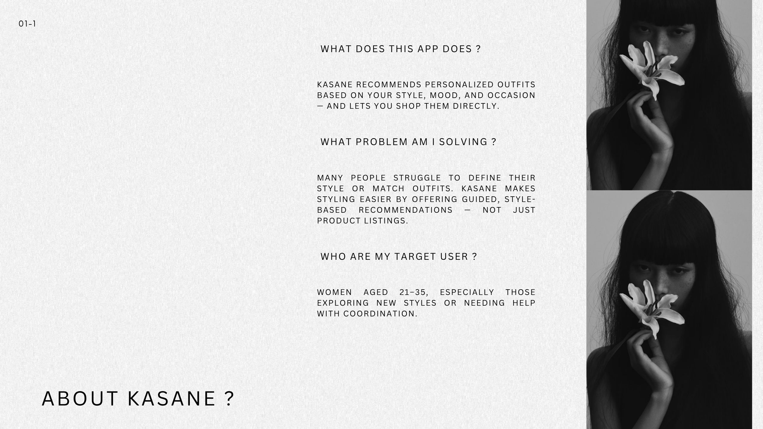
I designed Kasane end to end: research, information architecture, interaction and visual design, plus usability testing and iteration. The project lasted about six to eight weeks—one week to map the landscape and define scope, two weeks to shape concepts and build prototypes, one to two weeks to run tests and fix what broke, and the rest to tidy the system and docs. I worked in Figma/FigJam and kept research notes and decisions in Notion. Kasane arranges fashion by style, mood, and occasion so people spot a look first and then pick the pieces without losing the vibe.
Background
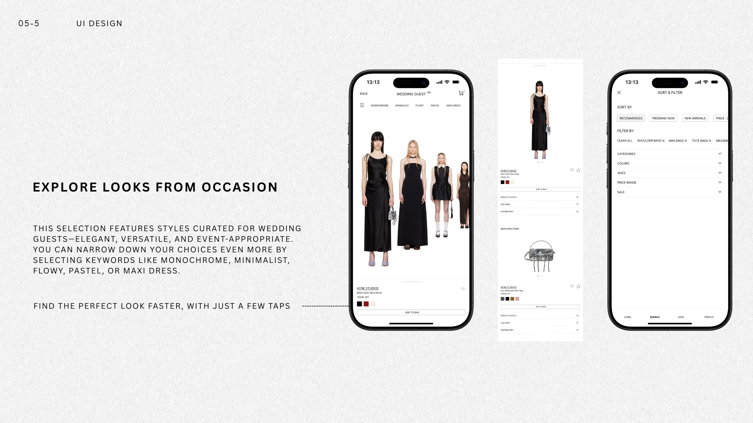
Most fashion apps still start with brands and long product lists. That flow suits searching, not deciding. Our audience—women in their twenties and early thirties who want guidance or want to try new styles—often knows the feeling they’re after but can’t quickly turn that into a clear look with items they can buy now. Kasane flips the order: start with the look to create the spark, then show the facts (silhouette, fabric, price range) right where the decision happens.
Problem
On a typical e‑commerce site you bounce between brands, categories, colors, and sizes. Building a full outfit takes work, and the “does this feel like me?” question is left unanswered. The crucial details—fit, fabric behavior, styling context, stock, budget—arrive in pieces across different pages, which slows people down right before add‑to‑cart. Many apps also ask for an account too early and kill the momentum.
Goals and how I measured progress
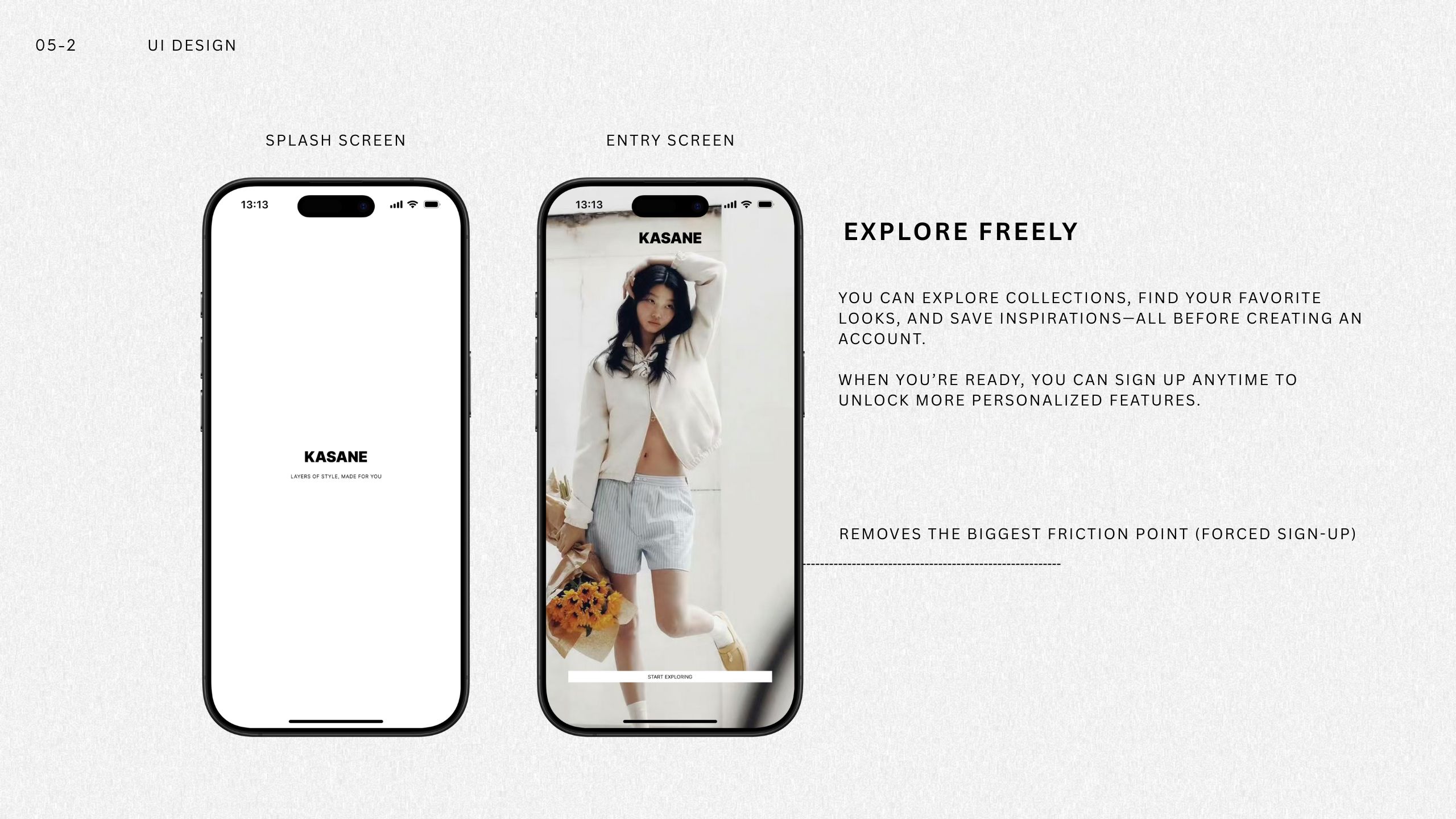
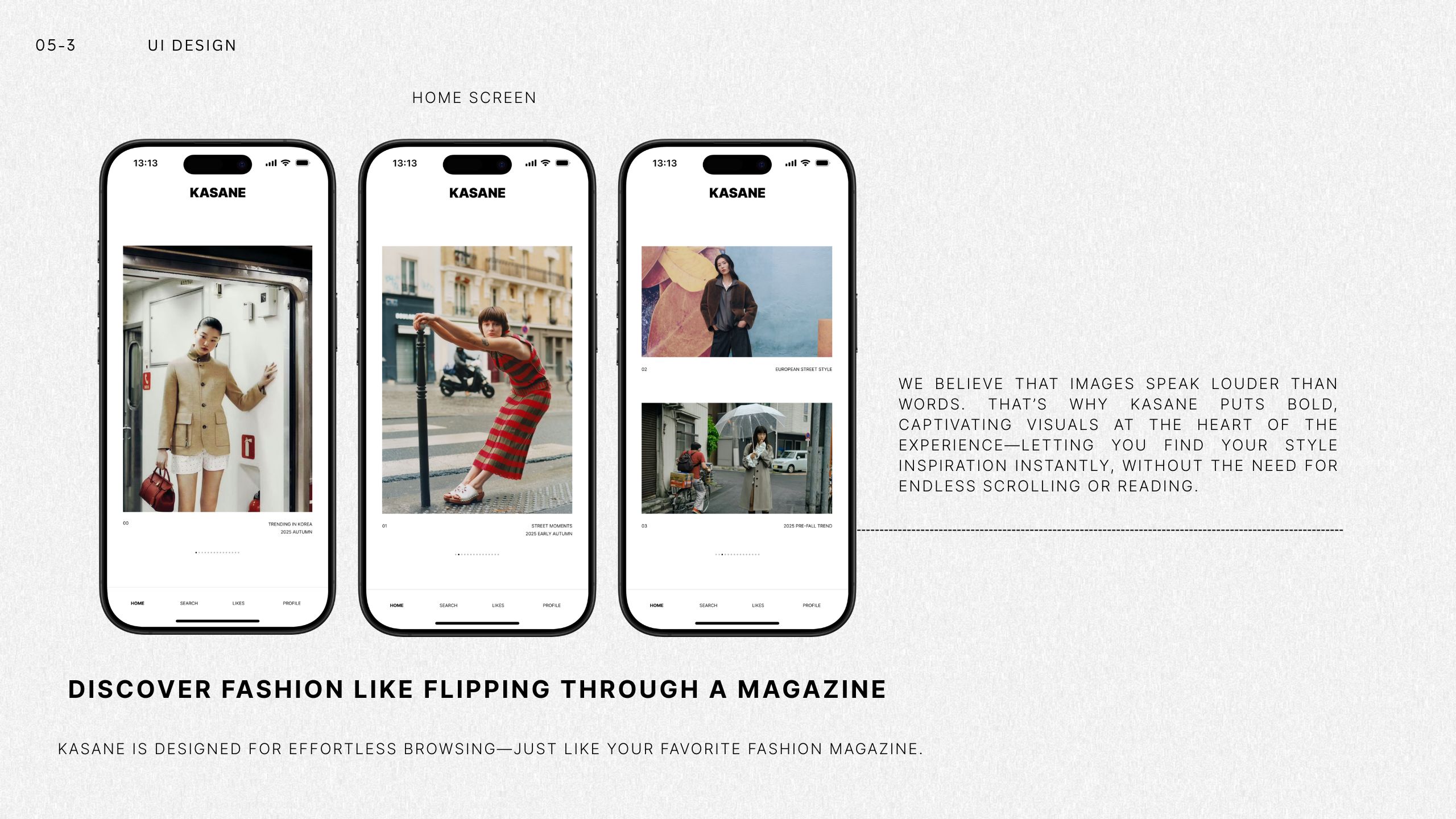
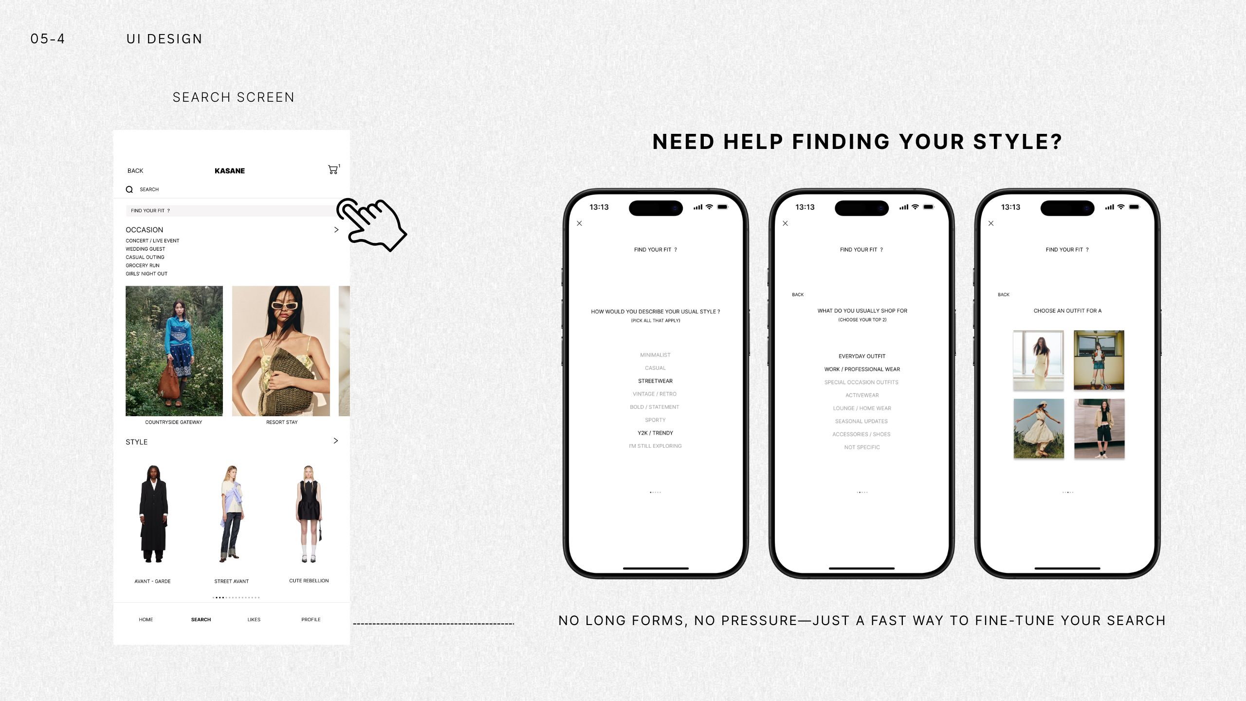
My goal was to shrink the gap between “I like this” and “I’ll buy this.” Within about ten seconds of landing, people should see at least one look worth opening. On the look page, the first screen should already tell them the silhouette, the fabric story, and roughly where the price sits. Before signing up, they should be able to save and add to cart so curiosity turns into action instead of a wall. Early on I checked this qualitatively in tests; once live, I plan to confirm with experiments and basic analytics.
Market Research
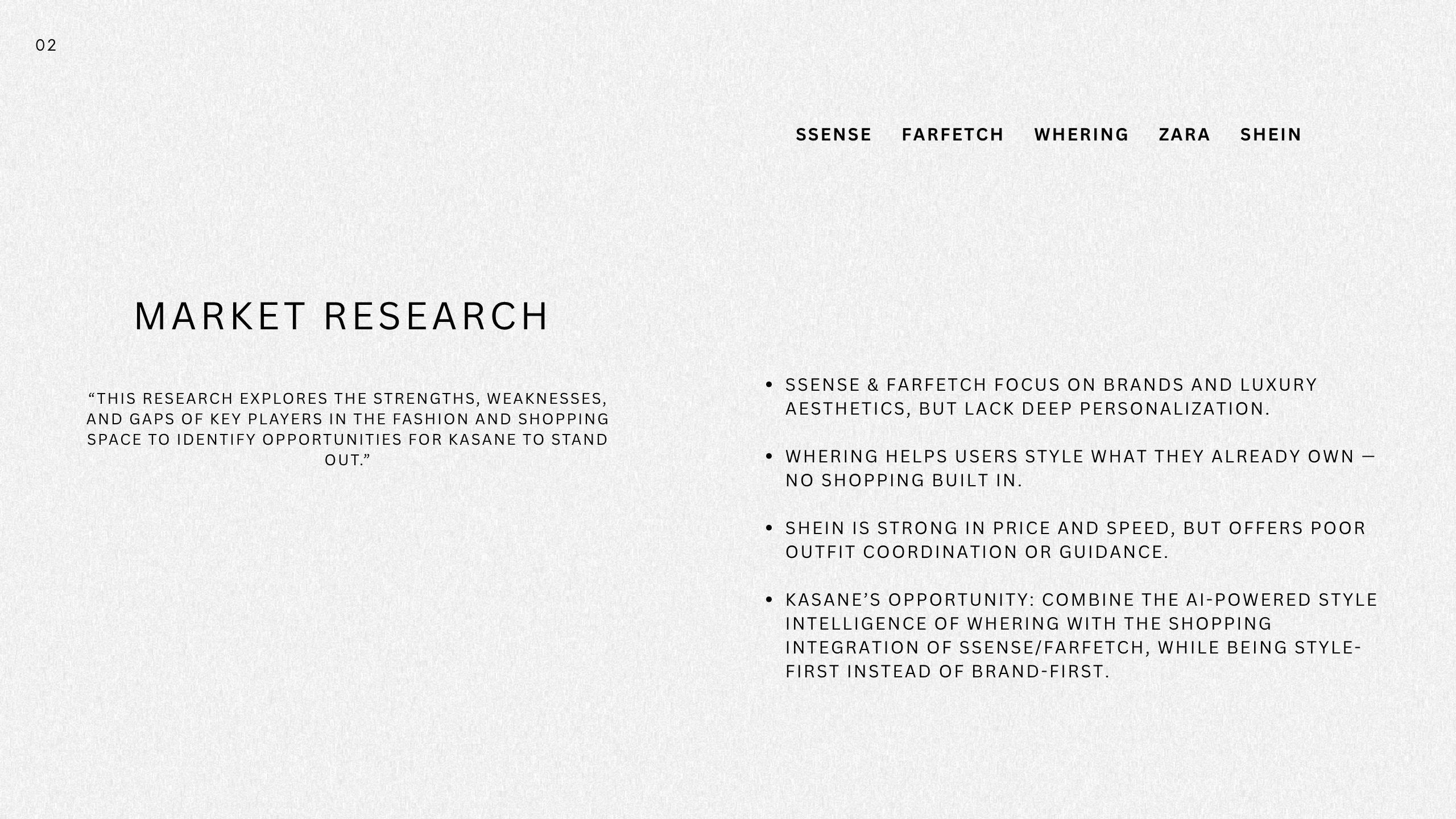
This market research analyzes major competitors in the fashion and shopping experience space — SSENSE, Farfetch, Whering, Zara, and SHEIN. While each excels in different areas, all reveal gaps that create an opportunity for Kasane.
Luxury platforms like SSENSE and Farfetch emphasize brand-driven discovery but offer very little personalization around the user’s style. Whering focuses on helping users style their existing wardrobe, yet it lacks integrated shopping functionality. On the opposite end, fast-fashion players like SHEIN are affordable and fast, but provide weak styling guidance and low emphasis on personal expression.
Kasane fills this gap by placing style first, not brand — combining smart outfit recommendations powered by AI with a seamless shopping experience. Kasane helps users build personal style while discovering pieces that truly match who they are.
User Personas
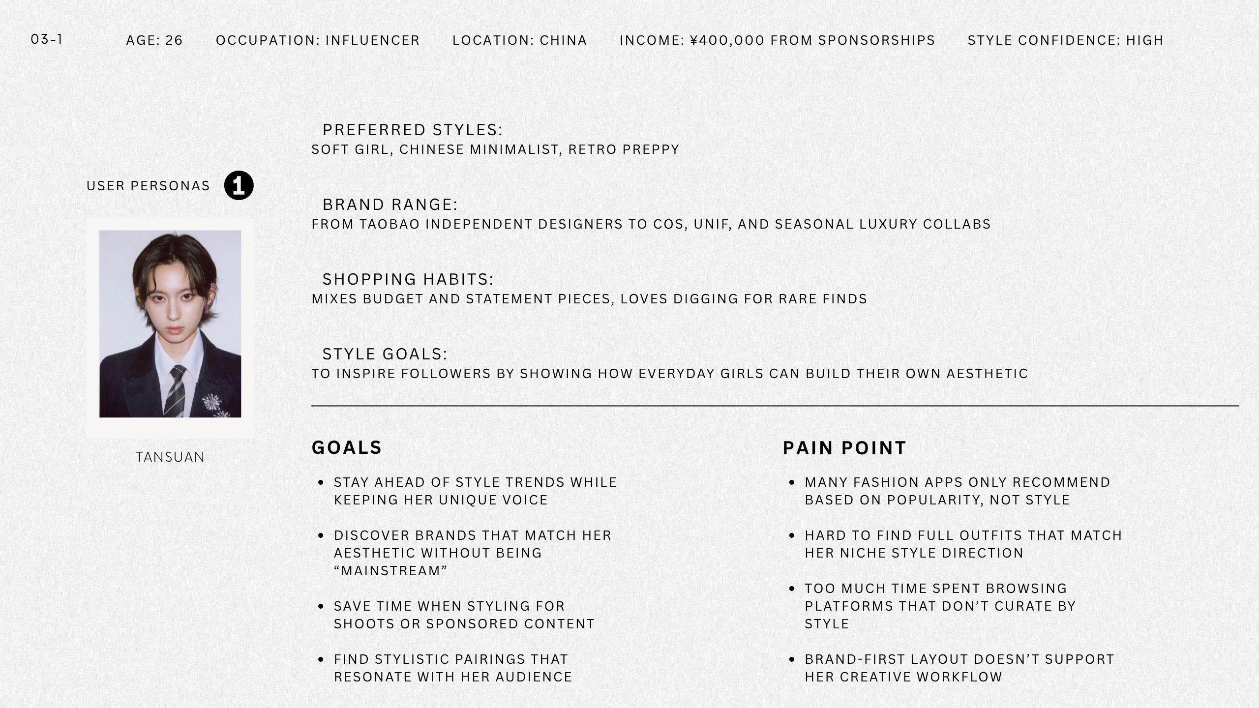
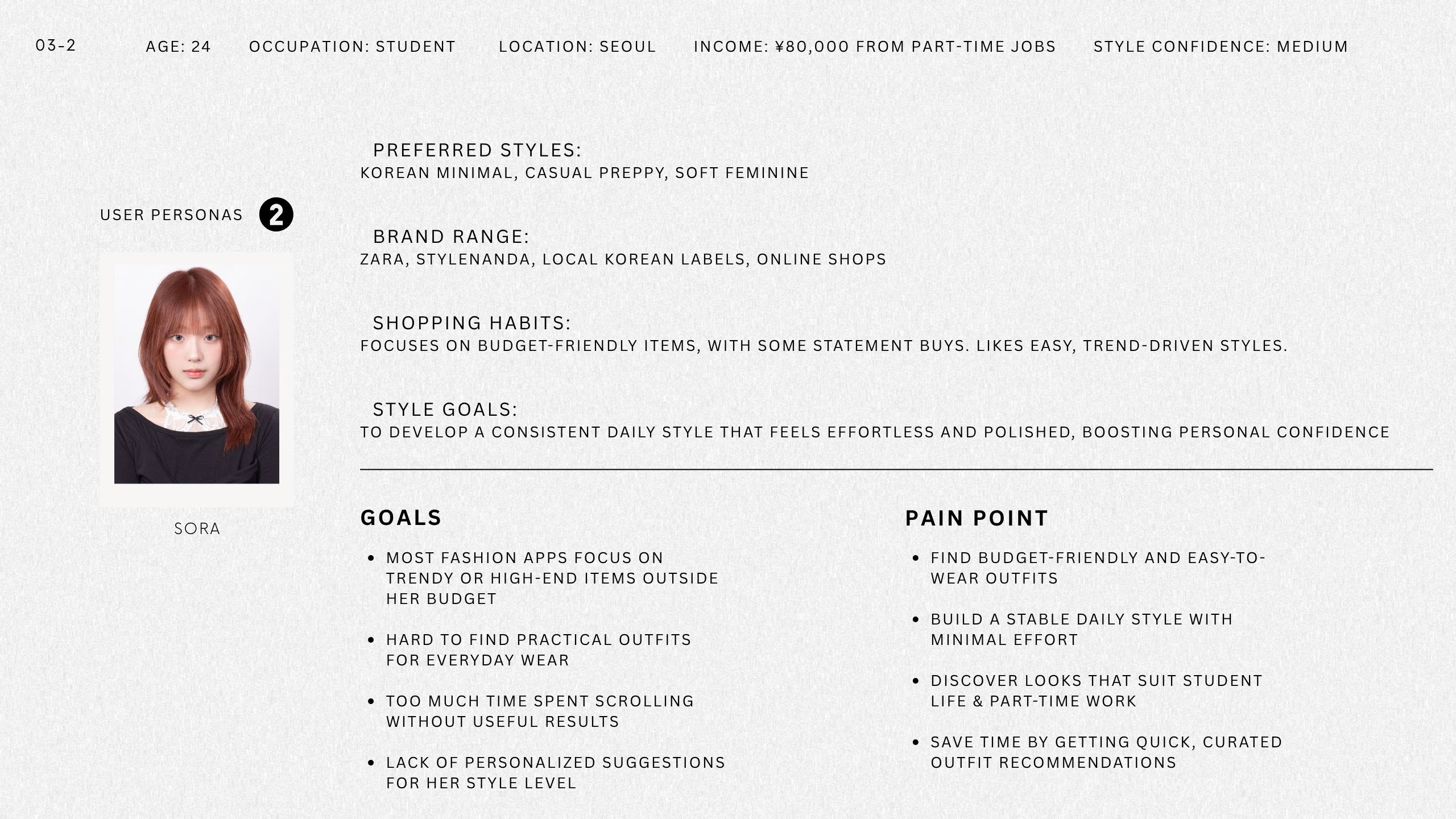
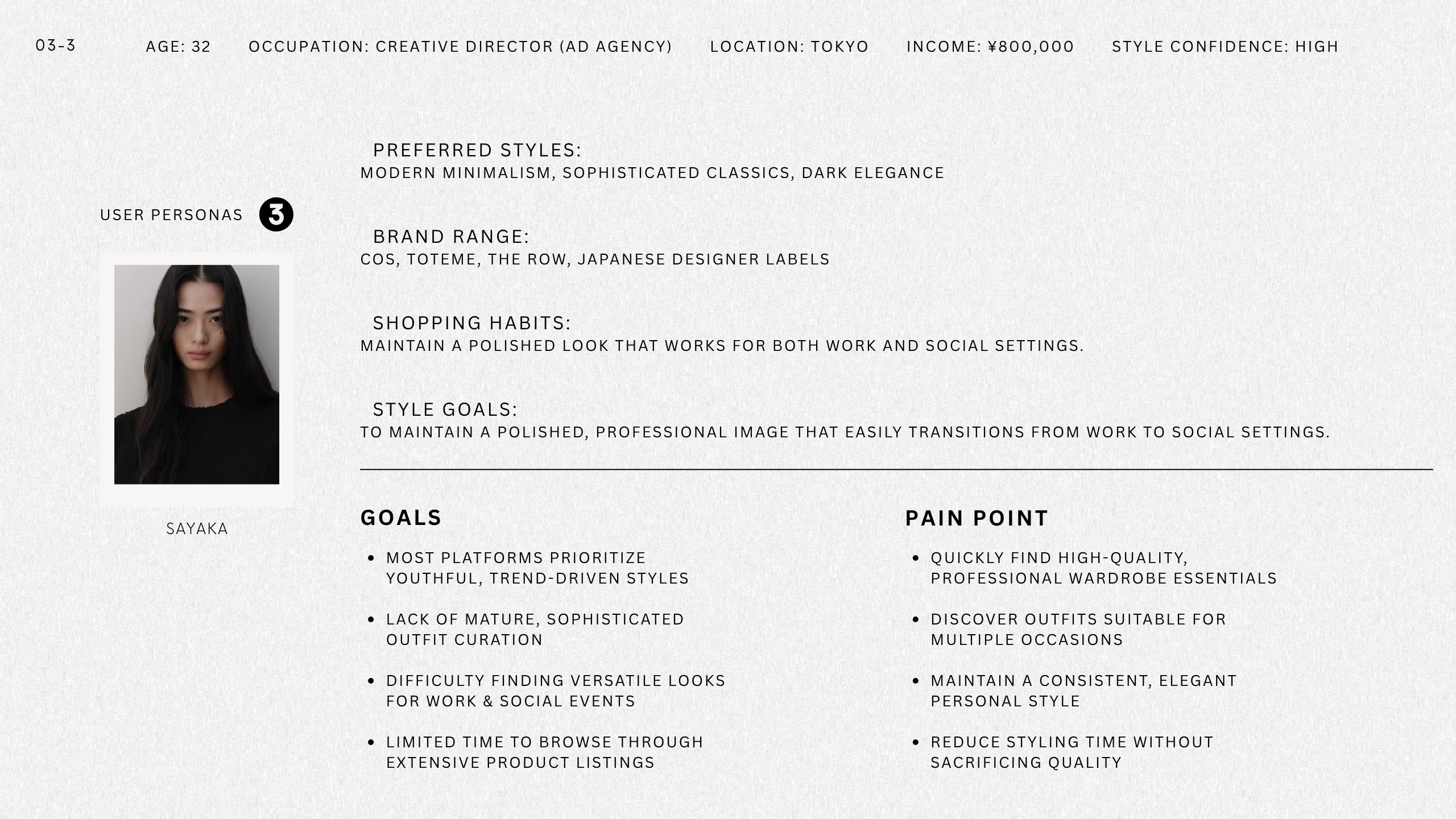
Through qualitative and market research, I constructed three representative personas that reflect Kasane’s key audience segments.
By understanding their style goals, budget limitations, and pain points, I uncovered an opportunity to shift from brand-first shopping to a style-first experience — shaping both UX priorities and feature scope.
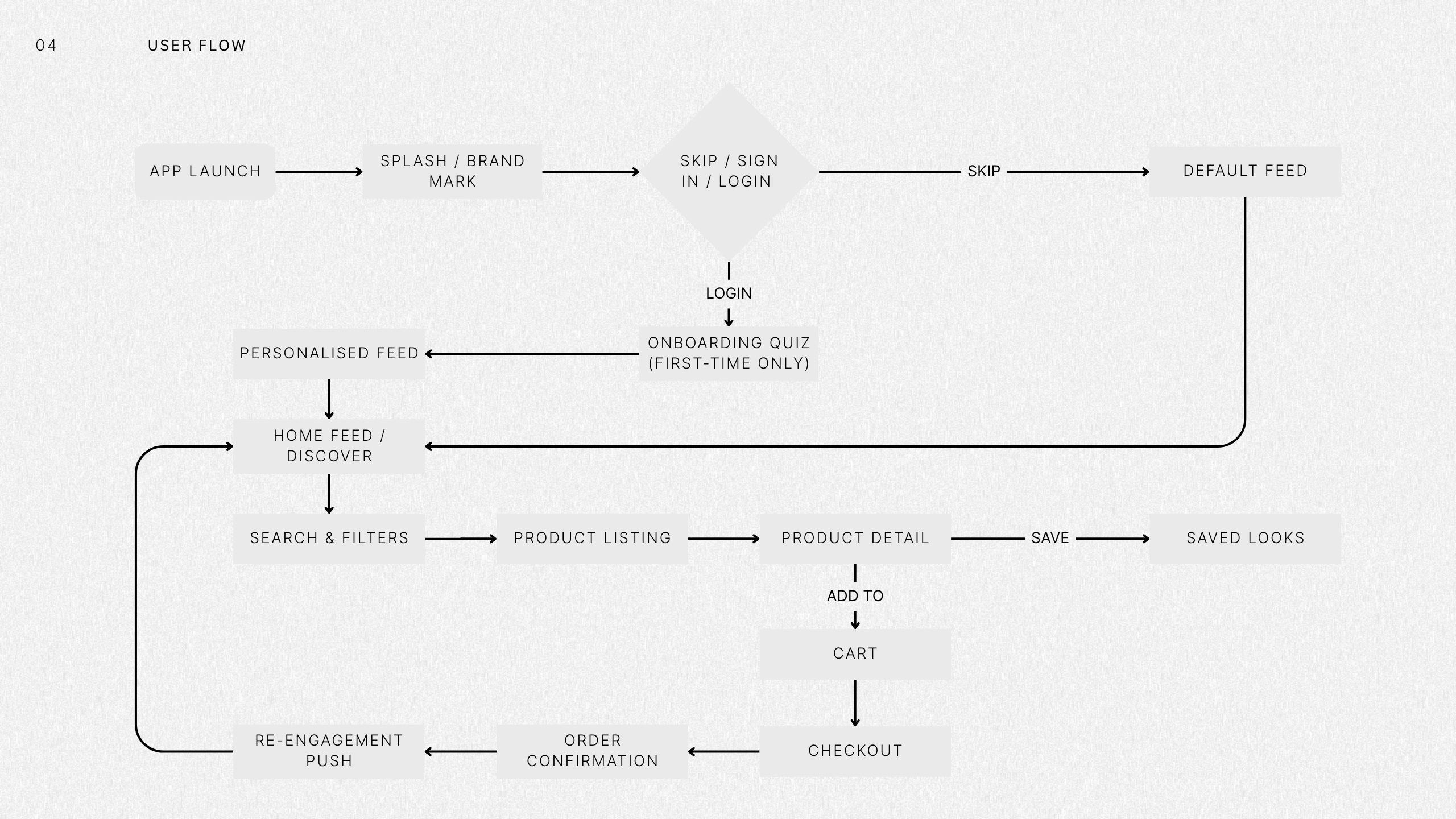
User flow
UI Visual Design System
UI Design